
The benefits of responsive design: An optimal user experience

Over 60% of global web traffic now comes from a smartphone or tablet. In this context, a website that doesn't automatically adapt to screen size loses visitors, loses credibility, and loses rankings in Google. Responsive design is the technical, UX, and strategic answer to this challenge.
But what exactly does responsive design offer? And why has it become non-negotiable for any serious web project in 2026?
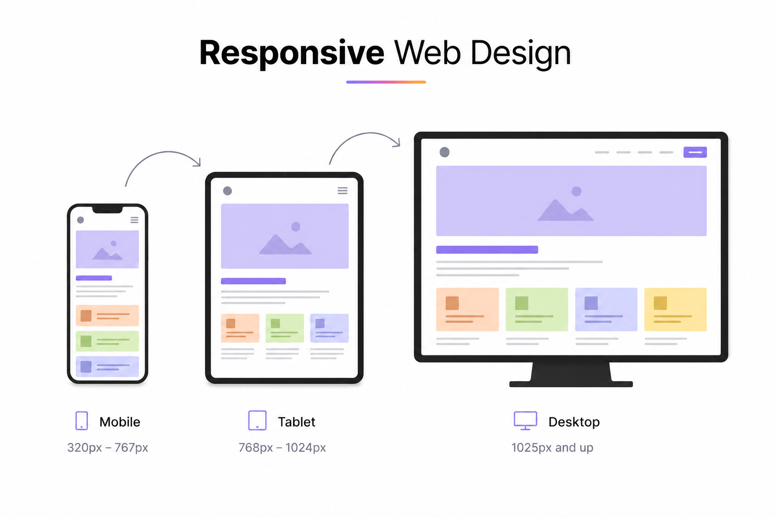
What is responsive design?
Responsive design, or adaptive design, is a design approach that allows a website to display correctly on all types of screens: smartphones, tablets, desktop computers, connected TVs. The layout automatically reorganizes itself based on the screen's resolution and size, without requiring a separate version of the site.
Technically, it relies on three pillars: fluid grids (percentage-based proportions rather than fixed pixels), flexible images (which adapt to their container), and CSS media queries (which apply style rules based on screen characteristics).
1. A frictionless user experience, across all devices
A non-responsive site forces the user to zoom in, zoom out, and scroll horizontally. This kind of friction is fatal: according to Google, 61% of users will not return to a poorly adapted mobile site, and 40% will go directly to a competitor.
Responsive design eliminates these frictions. Navigation, readability, and the accessibility of buttons and forms: everything is designed to work natively on mobile. The result is a fluid experience that encourages visitors to stay longer, explore more pages, and convert.
2. A direct impact on natural search ranking (SEO)
Since 2019, Google has been using mobile-first indexing: it's the mobile version of your site that is primarily analyzed for ranking, regardless of how your visitors access your content. A responsive site directly meets this requirement.
Specifically, adopting responsive design improves several key SEO signals:
- Bounce rate : smooth mobile navigation reduces immediate exits, a positive signal for Google.
- Time spent on site : improved readability encourages users to consume more content.
- A single URL per page : unlike a separate mobile version (e.g., m.yoursite.com), responsive design avoids content duplication and concentrates SEO authority on a single URL.
- Core Web Vitals : a well-implemented responsive design contributes to better performance on the user experience metrics tracked by Google (LCP, CLS, FID).
3. One site to maintain: lower costs, greater efficiency
Before the rise of responsive design, it was common to manage two parallel versions of a website: one for desktop, one for mobile. This approach doubles development, content, and maintenance costs.
With a responsive website, a single codebase adapts to all contexts. Every content update, bug fix, or graphic evolution is done only once. This is a significant saving of time and money, particularly important for SMEs and freelancers who need to optimize their resources.
4. Improved Business Performance
The mobile experience has a direct impact on conversions. A contact form that's difficult to fill out on a phone, a button that's too small, a loading time that's too long: each of these friction points reduces the conversion rate.
Conversely, a well-designed responsive site makes every step of the user journey accessible and pleasant on mobile. For an online store, a showcase site, or a landing page, this directly translates into more contacts, quote requests, or sales.
5. Future-Proof Design
Responsive design isn't limited to today's devices. Its logic of fluid grids and conditional rules allows it to adapt to resolutions yet unknown: new smartphone sizes, foldable tablets, ultra-wide screens.
By adopting this approach, a website is designed to last without requiring a complete redesign with every market evolution. It's a strategic investment, not just a technical one.
Responsive Design and Webflow: A Natural Combination
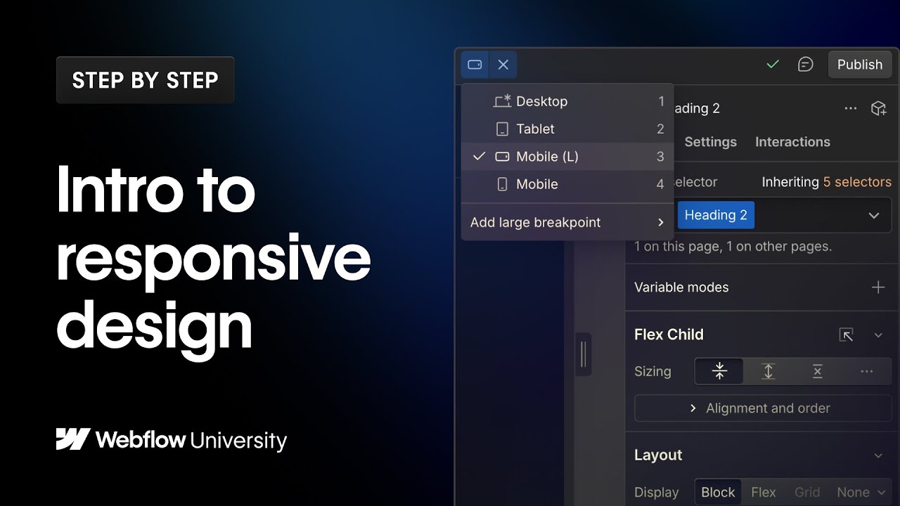
Webflow natively integrates responsive logic. Each component can be visually adjusted for desktop, tablet, and mobile, without manually writing CSS. This is one of the platform's major advantages: responsiveness is in the tool's DNA, not an afterthought.
As a freelance Webflow developer and designer, I approach every project mobile-first: the mobile version is conceived from the outset, and the desktop version is its extension. This ensures a consistent and high-performing experience across all devices.
Responsive design is the practice of creating websites that automatically adapt to different screen sizes and devices. In this Webflow University video, you'll learn how breakpoints work, how styles are inherited across devices, and the best practices for delivering a seamless user experience on desktop, tablet, and mobile.
In Summary
Responsive design is no longer a luxury or an added bonus: it's the minimum standard for any professional website. It improves user experience, strengthens SEO, reduces maintenance costs, and boosts business performance. Ignoring responsiveness in 2026 means ignoring more than half of your audience.
Looking to redesign your site or create a high-performing responsive website? Let's talk.
FAQ
What is responsive design and why is it mandatory in 2026?
Responsive design is a web development approach that allows a site to automatically adapt to the screen size it's viewed on: smartphones, tablets, desktops and connected TVs. In 2026 it's non-negotiable because over 60% of global web traffic comes from mobile devices, and Google penalises non-mobile-friendly sites since adopting Mobile First Indexing. A non-responsive site loses both visitors and search rankings.
What's the difference between responsive design and adaptive design?
Responsive design uses fluid grids and CSS media queries to continuously adapt the layout to any screen size. Adaptive design uses multiple fixed-layout versions of a page (for example, separate desktop and mobile versions) that load based on the detected device. Responsive design is now the standard because it's more flexible, easier to maintain and delivers a more consistent experience across the huge variety of screen sizes in use today.
How does Webflow handle responsive design?
Webflow natively includes a breakpoint system that lets you customise the layout for each screen size directly in the visual interface. By default, Webflow offers breakpoints for desktop (1280px+), laptop, tablet and mobile. The designer can adjust CSS properties (size, spacing, visibility, element order) per breakpoint without writing any code. This is one of Webflow's key strengths: precise responsive control without leaving the visual editor.
Does responsive design affect a site's performance and load speed?
A well-implemented responsive design doesn't negatively impact performance, and can actually improve it. Using adaptive images (srcset, WebP formats), avoiding loading unnecessary assets on mobile and simplifying animations on small screens produces a lighter, faster site. Conversely, a poorly done responsive implementation (oversized images, heavy CSS, unoptimised JavaScript) can significantly slow down the mobile experience.
Can my existing Webflow site be made responsive without rebuilding it?
Yes, in most cases it's possible to improve the responsiveness of an existing Webflow site without starting from scratch. This involves auditing the current breakpoints, fixing elements that overflow or overlap on mobile, optimising font sizes and spacing, and testing on multiple real devices. The amount of work depends on how the site was originally structured: a well-organised codebase (using Client-First for example) makes fixes much quicker.


